Since the Great Financial Crisis, monetary policy has emerged as a critical factor for investors. Gaining insight into central banks’ perspectives on the natural level of interest rates and their limitations crucial for achieving significant investment returns.
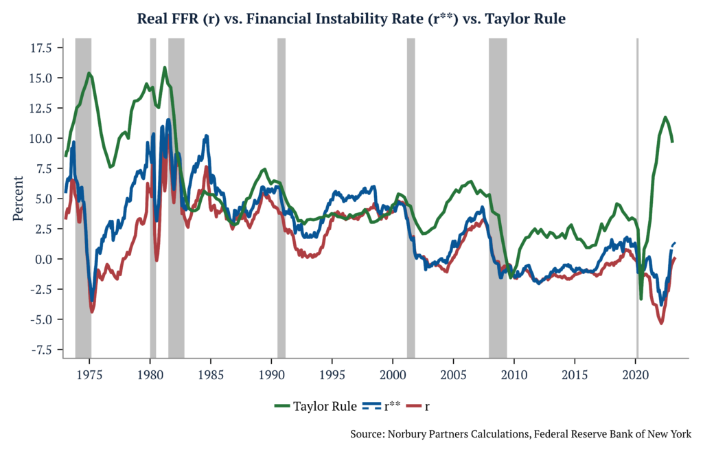
Why it matters: The Federal Reserve faces a challenge in balancing the long-term monetary policy rate needed to meet inflation targets (r*) with the level of the real interest rate that can potentially lead to financial instability (r**). Past experiences have demonstrated that, when confronted with this decision, the Federal Reserve has typically prioritized financial stability.
Financial Stability Real Interest Rate
The concept of the natural real interest rate, r*, has long been associated with macroeconomic stability. However, recent research[1] introduces a complementary notion called the “financial stability real interest rate,” r**. By examining the relationship between interest rates, financial vulnerability, and the real economy, we can uncover valuable insights into the dynamics of the financial system.
Defining the Financial Stability Real Interest Rate
The financial stability real interest rate, r**, is the level of the real interest rate that generates financial instability. It is quantified based on an environment where financial intermediaries face occasional binding credit constraints, leading to asset fire-sale dynamics. This two-state framework differentiates between financially tranquil periods and financial crises. r** serves as a quantitative summary statistic for financial stability, akin to r*’s role in measuring macroeconomic stability.
Implications of Interest Rate Movements
Consider a scenario with prolonged lower real rates. Initially, financial intermediaries benefit as their asset portfolios appreciate, boosting net worth and reducing leverage. Consequently, they are more willing to lend. However, the pursuit of higher yields leads to increased exposure to risky assets over time. This growing vulnerability makes intermediaries susceptible to the risk of insolvency in the face of future adverse economic shocks.
Interest rate changes have distinct impacts on financial stability in the short and medium run. In the short run, valuation effects similar to those observed during the 2023 banking turmoil dominate. r** measures the extent to which a surprise increase in rates can push the economy towards a crisis during tranquil periods. Conversely, during financial crises, r** indicates the necessary rate cut to alleviate the balance sheet constraints on financial intermediaries.
Interpreting Banking Turmoil
The collapse of Silicon Valley Bank provides a narrative to interpret financial vulnerabilities within the proposed framework. Two key elements, leverage ratio and the ratio of safe assets to total assets, play a crucial role in determining the banking sector’s vulnerability. The combination of a rapid increase in the Fed funds rate and quantitative tightening resulted in reduced reserves (considered safe assets) and potential unrealized losses in long-term Treasuries. These factors heightened effective leverage and raised financial vulnerabilities. Sales of such securities to meet deposit withdrawals exacerbated these vulnerabilities.
Evolution of the Financial Stability Real Interest Rate (r**)
Tracking the evolution of r** from the 1970s to 2022, notable patterns emerge. During the first part of the Great Moderation period, r** was consistently higher than r, with only short-lived stress episodes causing deviations. In the 2000s and after the Great Recession, the gap between r** and r narrowed. However, in the mid to late 2010s, r** once again surpassed r, except during brief periods of stress. The COVID-19 pandemic brought about significant financial stress in March 2020.
The concept of the financial stability real interest rate, r**, offers insights into the relationship between interest rates and financial stability. By considering the dynamics of the financial system, the effects of interest rate changes on vulnerability, and the implications for the real economy, policymakers gain valuable tools for decision-making.
The authors, affiliated with the Federal Reserve Bank of New York’s Research and Statistics Group, caution that r** should be viewed as a current indicator of financial stress rather than a predictor of future vulnerabilities. However, upon closer examination, we find that this model presents an inherent dilemma between the long-term monetary policy rate required to achieve inflation targets (r*) and the level of the real interest rate that gives rise to financial instability (r**). History has shown that, when faced with this choice, the Federal Reserve tends to prioritize financial stability.
In recent weeks, concerns over bank solvency have resurfaced in the markets, with Silicon Valley Bank (SVB) being taken over by regulators and UBS acquiring Credit Suisse for $3.2 billion. The takeover of SVB marks the second-largest bank failure in U.S. history and the most significant since the 2008 financial crisis.
Why it matters: While some attribute the recent events to executive mismanagement, we contend that they are symptomatic of a broader systemic issue. Rather than isolated incidents, they may represent the opening act of a potential future collateral crisis. What’s particularly worrisome is that if the collateral in question is so-called “risk-free” government bonds, we could be entering uncharted territory, leaving us with little recourse to address the issue. The short-term impact of recent events could be a significant curbing of credit to the economy, while the long-term impacts could pose an even more significant challenge to the financial system than the Great Financial Crisis.
The short-term effects of the most recent banking stress will be to reduce credit in the economy.
Regional banks are likely to curb credit for three primary reasons:
First, increasing regulation and the risk of executive prosecutions for mismanagement will create a risk-averse environment, leading these banks to reduce lending.
Second, the newly formed mechanism that gives these banks direct access to the Fed will increase the relative attractiveness of securities that can be posted as collateral, thereby decreasing the attractiveness of loans.
Lastly, the drop in deposits in these banks will create a hole that must be filled through wholesale funding provided by money market funds. While access to funding won’t be a problem, the rates charged for this funding will be higher than those on deposits, increasing costs for these banks, thereby pressuring their margins, reducing their profits, and potentially disincentivizing them from making new loans.
The recent events will also impact large banks, causing them to take a risk-averse stance for two main reasons.
First, the FDIC is not backed by taxpayer money but by the banks, particularly the well-run large banks. Apart from the direct cost of insuring all deposits of SVB, the possibility of new regulations requiring the FDIC to insure a larger portion of deposits will drive the profitability of these banks lower, reducing their willingness to lend.
Second, with regional banks now having direct access to the Fed, there is a new price-insensitive buyer of Treasuries that could pressure long-term rates lower while the Fed keeps the short-end of the curve higher through its hiking cycle, making curves flatter and reducing bank profits and their willingness to lend. These factors could lead to tightening credit and financial conditions, which could have significant implications for economic growth and stability.
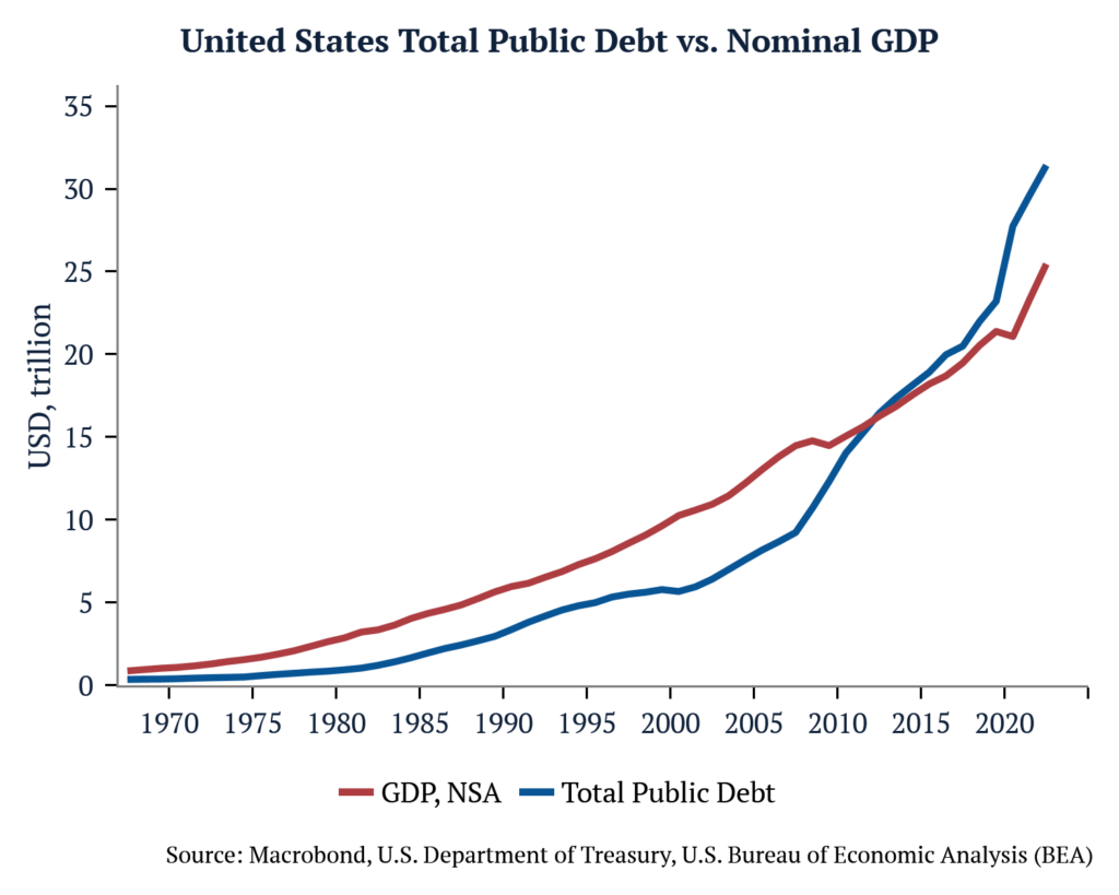
The long-term effects of the debasement of US Treasuries could be catastrophic to the global financial system.
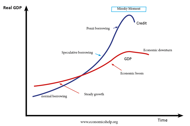
While it’s true that critics have pointed to mismanagement as a contributing factor in the sudden collapse of SVB, this only scratches the surface of a more significant issue at play. Banks were led to invest heavily in risk-free (US Treasuries) and quasi-risk-free (government-guaranteed) assets due to financial repression and regulation. “Hold to maturity” accounts further fuelled this trend by increasing the allure of such assets, leading to a dangerous level of complacency among banks. Therefore, while SVB may have been the first to fall, the underlying problem is much more pervasive and requires a more comprehensive solution. The possibility cannot be dismissed that we may be witnessing the initial signs of what could be the most significant Minsky Moment in history.
Named after economist Hyman Minsky, a “Minsky Moment” refers to a sudden collapse of asset prices following a long period of growth. Minsky believed that during periods of economic stability and growth, investors and lenders become increasingly complacent and take on more and more risk. This leads to a build-up of financial fragility, with borrowers becoming increasingly over-leveraged and lenders becoming more lax in their lending standards.
Eventually, the economy reaches a tipping point where borrowers can no longer meet their obligations, and the value of assets used as collateral declines rapidly. This triggers a panic among lenders and investors, who try to liquidate their assets, causing a further reduction in asset prices and triggering a financial crisis.
Minsky moments have been observed in many historical financial crises, such as the 2008 global financial crisis, the dot-com bubble burst in the early 2000s, and the savings and loan crisis in the 1980s.
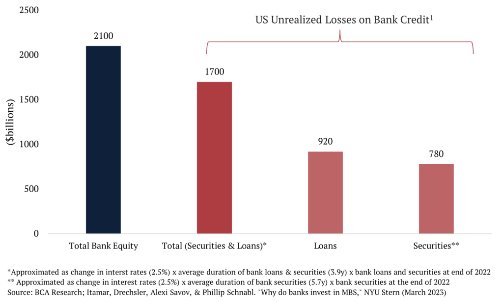
It’s worth noting that the estimated losses on securities only represent a fraction of the total unrealized losses that banks have experienced due to the rise in interest rates. Loans, much like securities, also experience a decrease in value when interest rates increase. With a total of $17.5 trillion in loans and securities as of December 2022 and an average duration of 3.9 years, the total unrealized losses on bank credit amounted to approximately $1.7 trillion (calculated as $17.5 trillion x 3.9 x 2.5%). This figure is only slightly less than the total bank equity capital of $2.1 trillion in 2022, indicating that the losses resulting from the interest rate increase are on par with the entire equity of the banking system.[1]
While it’s crucial to consider losses incurred on assets, even if they are unrealized, the most significant issue is the impact those losses have on a bank’s ability to refinance its outstanding debt. Financial institutions rely heavily on short-term, wholesale dollar funding through collateral considered “safe.” However, a lack of such “safe” collateral can lead to a catastrophic failure of the financial system. Therefore, while the losses on assets are important, the loss of confidence in the ability to refinance their outstanding debt poses the most significant risk to the banking system.
A prime example of the risks associated with a lack of “safe” collateral can be seen in the lead-up to the 2008 Global Financial Crisis. JP Morgan provided cash to Lehman Brothers to conduct its daily business. However, as Lehman’s collapse loomed, JP Morgan began to question the value of the collateral that Lehman had pledged, suspecting that it was worth less than initially claimed. As a result, JP Morgan required Lehman to pledge more collateral as a condition for continuing its operations. This scramble for the most “pristine” collateral highlights the dangers of a shortage of “safe” collateral, which can ultimately lead to a decrease in USD funding worldwide as chains of wholesale dollar transactions begin to unravel.[2]
What could cause the debt of a sovereign country with a free-floating exchange rate and holds reserve currency status to become risky? Inflation. The Fiscal Theory of the Price Level suggests that higher inflation may be forthcoming, which could lead to the “risk-free” status of government bonds being called into question. If this were to occur, it could potentially leave us in uncharted territory with few tools at our disposal to address the issue. Therefore, inflation poses a significant risk to the perceived safety of government bonds and could have far-reaching consequences for the broader financial system.
The majority of U.S. government debt is issued with a nominal face value in U.S. dollars, meaning its real value or purchasing power is determined by dividing the value of outstanding nominal debt by the price level. The intertemporal government budget constraint stipulates that the real value of debt is linked to the real value of future surpluses. When considering the intertemporal government budget constraint as an equality, changes on the right-hand side (such as increases or decreases in future fiscal variables) correspond to changes on the left-hand side (i.e., real debt). Since the nominal value of outstanding debt is predetermined, the price level is the variable that adjusts to reflect changes in fiscal variables on the right-hand side of the constraint.[3]
Our own analysis also shows[4] that we do not anticipate the favorable inflation outcomes of the past three decades to continue over the next few decades. Apart from a stronger fiscal position, the favorable inflation environment of the past three decades was partly due to the increased global productive capacity resulting from the dissolution of the Soviet Union and the inclusion of China and India in the global trading market. Additionally, financial markets had become more interconnected, resulting in the greater deployment of the world’s savings toward cross-border investment financing. These factors contributed to lower inflation expectations and reduced risk premiums.
[1] Source: Itamar Drechsler, Alexi Savov, and Philipp Schnabl, “Why do banks invest in MBS?,” New York University Stern School of Business, March 13, 2023.
[3] Lubik, Thomas A. (September 2022) “Analyzing Fiscal Policy Matters More Than Ever: The Fiscal Theory of the Price Level and Inflation” Federal Reserve Bank of Richmond Economic Brief, No. 22-39.
[4] Macro Minute: What If (Dec 2022), Macro Minute: A Tale of Two FOMCs (Nov 2022), Catalysts Into Year-End (Oct 2022), Macro Minute: We Learn From History that We Do Not Learn From History (July 2022), Norbury Partners 2022 Annual Report (June 2022), Macro Minute: Flat as a Pancake (Mar 2022), Macro Minute: The Reflexivity of Inflation & Conflict (Mar 2022), Macro Minute: Speak Harshly and Carry a Small Stick (Feb 2022), Special Report: A Changing Paradigm (Aug 2021) – for any of these reports, please contact ir@norburypartners.com or visit our website.
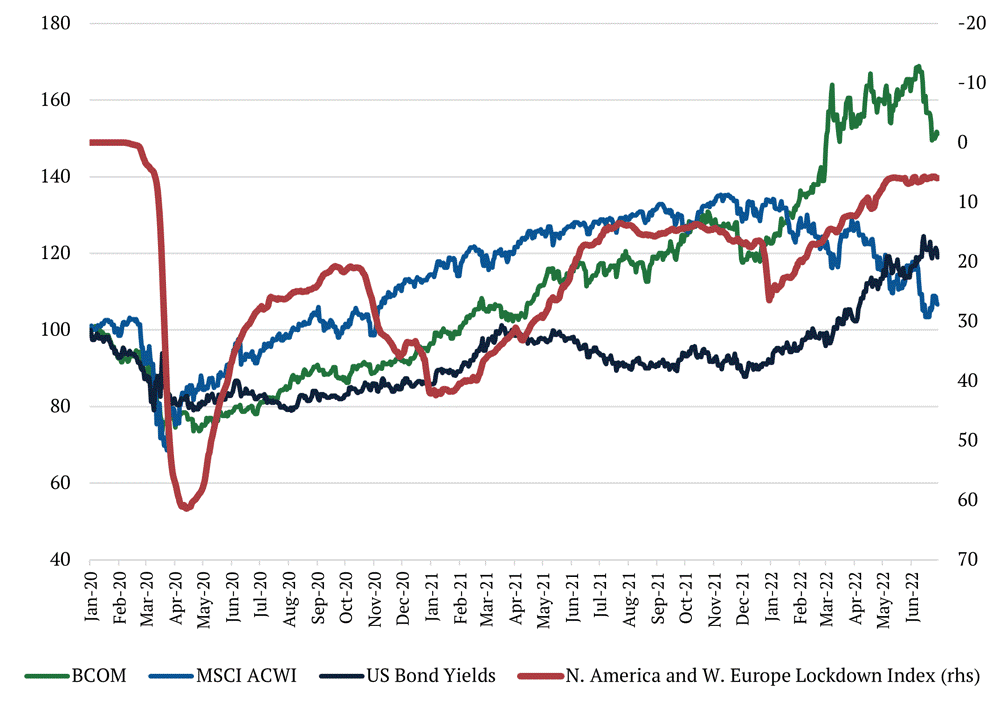
Over the course of November, rumors gave way to real policy and rhetoric changes from the Chinese government pointing to a gradual reopening of China’s economy and the backing off of Zero-Covid policies. We saw a modest rally in commodities and beat-down Chinese tech names moved higher in the equity market, but an examination of asset class performance as lockdowns reversed in the West can give us some clues to the performance of asset classes over the next several months.
At the onset of Covid, swift and extreme lockdowns drove commodity and equity prices lower, as well as the yields on long-dated US Treasury bonds (using TLT as a proxy). As the first wave of lockdowns eased, we can see that the first asset class to move back towards pre-covid levels was equities (using MSCI ACWI as a proxy), where the rally didn’t cool off until central banks began hiking rates and yields on US long bonds began to recover in 2022. Commodity markets moved next, with increasing economic activity from less severe lockdowns leading to increased consumption of commodities, be it agricultural or energy. The correlation between commodity prices and Western lockdowns is fairly strong; commodity prices (using Bloomberg Commodity Index as a proxy) traded range-bound when the lockdown index flat-lined in 2021, and then began to rally again as lockdowns effectively reversed as we entered 2022 before trading effectively range-bound again.
With the reopening of China, we’d expect a similar phenomenon. Equities price expectations of future cash flows and are likely to be the fastest asset class to recover with new policies as investors discount greater cash flow in the coming years from an open China. Commodities are a real asset, and while speculative capital is active in the space, demand will have to pick up with increased economic activity for fundamentals to move prices higher. Using the same Lockdown Index methodology used above for North America and Western Europe, even with recent relief, China is somewhere between 35 and 50, equal to that of Western economies in the summer of 2020 or early-2021.
China is one of the largest consumers of commodities in the world. Looking through the weakness in backward-looking Chinese data will be important when determining where commodities prices may be heading.
FOMC December 13-14th, 2022
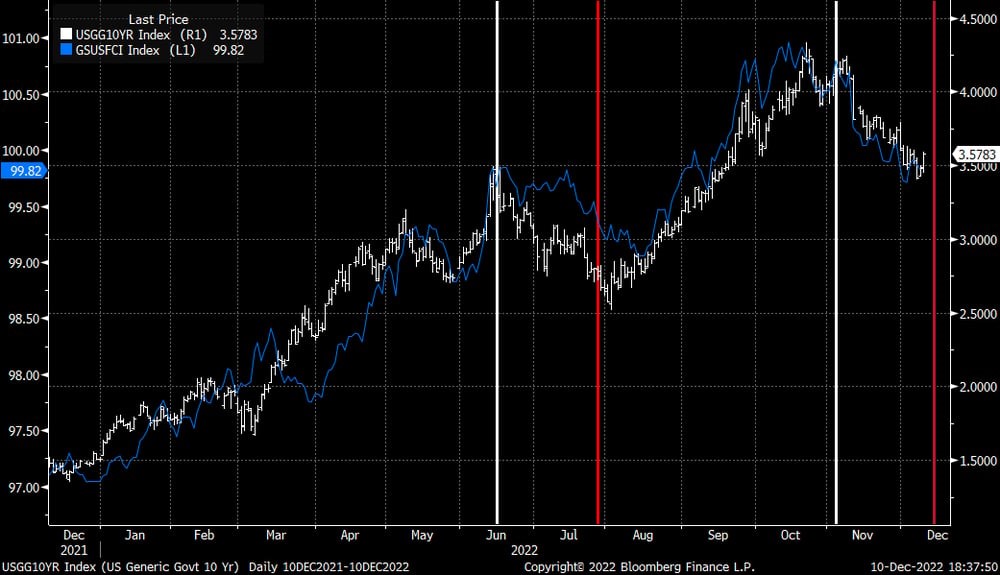
At the same time, we’re looking ahead to next week’s FOMC meeting. In June, after the Fed introduced jumbo-sized 75 basis point hikes, commodity prices and inflation breakevens fell, bonds rallied, and the market began to price a Fed pivot resulting in a bout of easing financial conditions ahead of the July meeting. The Fed considers tighter financial conditions essential to achieving goals around price stability, and after the market perceived the July press conference as dovish, Chair Powell used his speech at Jackson Hole to drive home the Fed’s goals for tighter financial conditions.
Since the November meeting when the Fed alluded to slowing the pace of rate hikes, financial conditions (as measured by the GS US Financial Conditions Index) have once again loosened to where they were at the June FOMC meeting and 10-year bonds have also aggressively rallied, with yields similarly around where they were at the June meeting. Given the Fed’s focus on tighter financial conditions, and its response the last time conditions loosened so quickly, we expect a combination of more hawkish rhetoric and/or a more aggressive dot plot to drive financial conditions tighter and yields higher coming out of next week’s meeting.
For many decades now, world leaders have slowly come to terms with the realities of climate change. More recently, we have seen the public and private sectors starting to translate promises into actions through various investments. As we move from theory to practice, agents are beginning to run against obstacles that were not clear before.
It has become increasingly clear that the world lacks the investment in natural resources necessary to make the green energy transition a reality. Setting aside the requirements for building solar and wind power on a global scale, the Geological Survey of Finland (GTK) recently released a study examining the volume of metals needed to build the first generation of electric vehicles (e.g., replacing every vehicle in the global fleet today with one EV) and the power stations (e.g., batteries) necessary to store intermittent electricity generated from renewable sources. They estimate that one generation of electric vehicles (1.39 billion) will require over 280 million tons of minerals and another 2.5 billion tons of metals for power storage projects to support such an increase in electricity consumption. In sum, current estimates for global reserves of nickel, cobalt, lithium and graphite are not sufficient to support such a massive undertaking.
On the geopolitical front, the ongoing realignment of world power will also have a material impact on access to materials and their ESG qualities. The world’s largest nickel producer is Indonesia, where mines are developed in the most biodiverse biome on the planet—rainforests; its biggest and cheapest nickel operation is Nornickel, located in Russia. The world’s largest cobalt producer by far is the Democratic Republic of the Congo (DRC), where not only does the climate range from tropical rainforest to savannahs, but also the exploitation of child labor is a major social concern. While China is responsible for 64% of graphite mining, it also has a controlling interest in much of the DRC’s cobalt production, and maintains an overwhelming majority of the refining capacity for lithium, nickel sulfate, manganese and graphite.
The unprecedented demand for green-transition minerals meets a supply picture that is very constrained and will generate prohibitive costs to the energy transition. That happens while billions of people lack cost-effective access to the energy they need to prosper.
Deep-sea mining offers a very interesting alternative to this problem. The USGS estimates that the Clarion-Clipperton Zone, “the largest in area and tonnage of the known global nodule fields,” contains 21.1 billion tons of dry nodules. Based on that estimate, tonnages of many critical metals in the CCZ nodules are greater than those found in global terrestrial reserves. Given the high ore grades found in nodules, and the simplicity of recovery, many companies in the space estimate that deep-sea nodule recovery will be one of the lowest cost producers of critical minerals in the world. The same USGS publication mentioned above notes, “if deep-ocean mining follows the evolution of offshore production of petroleum, we can expect that about 35–45 percent of the demand for critical metals will come from deep-ocean mines by 2065.”
Like any extractive activity, this kind of endeavor also carries costs along with its benefits. However, their costs are different from what one would think at first. The vanguard of deep-sea mining does not involve drilling and mining pits. Instead, it is focused on the harvesting of nodules. Nodules are fist-sized lumps of matter that collect on the ocean floor over thousands of years when currents deposit mineral sediments. Different parts of the ocean contain nodules rich in different elements. Those found in the Pacific Ocean have been shown to contain incredibly rich deposits of copper, nickel, cobalt, and manganese with ore grades superior to many, if not all, of today’s land-based reserves. Nodule collection occurs between 4,000-6,500 meters in the aphotic zone where sunlight does not penetrate and biodiversity is faint. Its process is minimally invasive and entails the scraping of about 6 inches of the ocean floor to separate nodules from sediment, depositing most of what is not used back to its original place. MIT researchers recently published results of a study demonstrating that 92% to 98% of the sediment either settled back down or remained within 2 meters of the seafloor as a low-lying cloud. The plume generated in the wake of the collector vehicle stayed roughly in the same area rather than drifting and disrupting life above.
The benefits are potentially many. From an environmental point of view, this process has enormous advantages when it comes to the impact on deforestation, destruction of carbon sinks, and water usage. From a social aspect, deep-sea mining also appears to be superior to other extractive activities on land, with limited exposure to the negative social dynamics of social displacement, corruption and child labor. If proven to be cost-efficient, it would also promote clean and cheap energy creating prosperity for billions of people. Should the environmental studies of nodule collection continue to be positive, nodules present a promising alternative to solve our natural resource problem in the face of a green transition. As the West looks to become both greener and less dependent on “unfriendly” sources of labor and natural resources, it must take a pragmatic approach toward deep-sea mining, recognizing that there is no such thing as a perfect solution, but this could be the next best thing for achieving the future we want.
On the artist’s color wheel, red and green are considered complementary colors, diametrically opposed from one another but known to harmonize when used together. However, for at least a decade, the biggest political proponent of green energy in America has been the “blue” Democratic Party.
The administration’s most recent spending bill, The Inflation Reduction Act of 2022, has been heralded as a huge leap forward for renewable energy in the United States by Democrats, but was opposed by every Republican in the House and Senate. A closer look at where renewable infrastructure is being built, thereby creating jobs and increasing investment, demonstrates that while on Capitol Hill, the reds may be diametrically opposed to green legislation, red and green may actually be quite complementary. We believe that green investment will have meaningful repercussions come election season for years to come.
In our 2021 Annual Report, we discussed how our most probable scenario for achieving net-zero by 2050 would require expansive transmission and generation infrastructure to be built in the American heartland, primarily in traditionally Republican states. In turn we suggested that the development of said infrastructure would result in significant job creation and local investment, that would lead to one of two outcomes – more bipartisan support for investment in green infrastructure as Republicans acted in the interests of their constituents or a change in voting patterns by those being positively impacted by investment and new jobs.
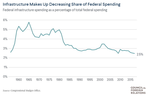
A 2014 study by the University of Maryland found that a $1 spent on infrastructure investment added as much as $3 to US GDP[1] and suggested that the effect could be even larger in a recession. Historically, state and local governments have borne the majority of costs for spending on infrastructure – since 1956, they have been responsible for approximately 75 percent of spending on infrastructure. In that time frame, federal infrastructure spending has increasingly become a smaller percentage of the overall budget.
When the federal government does spend, it is typically through capital investment for new projects or modernization. The nonprofit, nonpartisan Tax Foundation estimates $116 billion of new energy and climate spending, excluding tax credits, from the newly passed legislation.[1] Including leverage available through components of the bill like the Energy Infrastructure Reinvestment Financing program, which provides $5 billion to finance up to $250 billion in projects for energy infrastructure, including repurposing or replacing energy infrastructure, takes new spending to more than $300 billion over 10 years. The last Congressional Budget Office estimate for federal government infrastructure spending was approximately $98 billion per year, meaning the bill would increase spending by around 30% annually, excluding tax credits that will encourage more private investment. Why is this important? Using percent changes in GDP, inflation, and the S&P 500 as barometers for economic conditions, Lewis-Beck and Martini[2] demonstrated the existence of a map from real economic conditions, to voter perceptions, to vote choice. Put simply, voters’ evaluation of the economy is real, and they punish or reward the incumbent candidate based on these conditions.
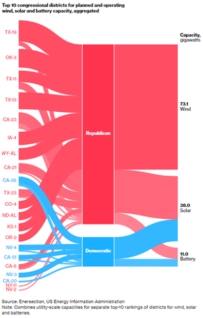
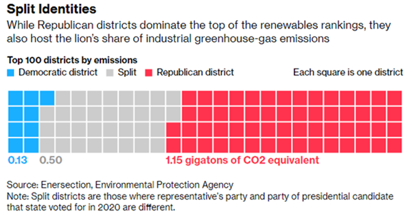
Bloomberg recently ran an article titled ‘Red America Should Love Green Energy Spending’, showing where a bulk of renewable infrastructure is being built. There are 435 congressional districts in America. 357 have planned or operating solar plants, with 70% of the power capacity found in republican districts. 134 have planned or operating wind plants, with 87% of the capacity found in red districts. Lastly, 192 have planned or operating battery storage facilities, with 58% of the capacity in right-leaning districts. Of the top-10 districts with planned or operating renewable infrastructure, nine are currently Republican-held seats, and within that group, 86% of total capacity is found in Republican districts.
So why might Republicans who are overwhelmingly benefiting from job creation and investment in green infrastructure be against such legislation? First, some of the capacity listed is planned, and has yet to filter through into the local economies they represent. Second, there are elements of both NIMBY-ism and extreme partisanship throughout the country on both sides that lead people to immediately dismiss ideas from “opposing” parties. But most obvious to us is that Republicans also overwhelmingly represent areas with the most emissions. 80% of the top-100 emitting districts are represented in Congress by Republicans, including eight of the top-10.
n the 2020 election cycle, fossil fuel companies spent $63.6 million lobbying Republicans compared to $12.3 million for Democrats, and since 1990 the industry has spent approximately 4.3 times the amount lobbying for Republicans than Democrats. In other words, support for green investment will ultimately come at a cost for the party. However, a myriad of studies have demonstrated that infrastructure investment boosts productivity over time and the literature shows that this will ultimately have an impact on voter preferences. Voter preferences fundamentally drive political rhetoric, so as green infrastructure investment becomes more pervasive, particularly in red states, we expect an increasing impact of renewable energy development on elections.
[1] Werling and Horst. “Catching Up: Greater Focus Needed to Achieve a More Competitive Infrastructure.”
[3] Lewis-Beck C, Martini NF. Economic perceptions and voting behavior in US presidential elections. Research & Politics. October 2020. doi:10.1177/2053168020972811
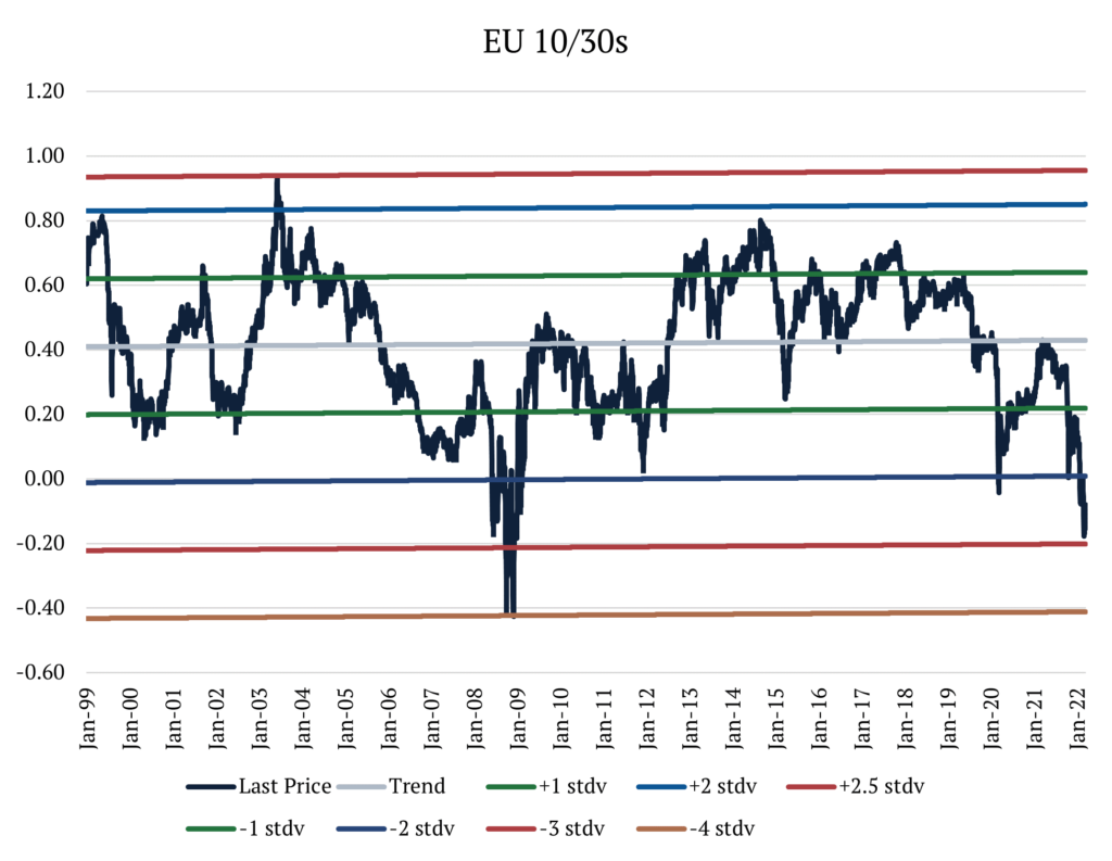
The flattening of interest rate curves is nothing new. In the US, swaps markets are pricing that in one year, the difference between the 2-year rate and the 10-year rate (the preferred reference for curve shape) will be -39bps, meaning the 2-year rate is 39bps higher than the 10-year. That compares to a difference of +140bps almost exactly one year ago, when the 10-year rate was materially higher than the 2-year.
Reasons abound, from the perception of more hawkish Fed policy given elevated inflation concerns, to lower pricing of terminal and neutral rate expectations as the Fed pulls forward the timing of the hikes.
What is more curious is how flat the very long end of the swap curve is right now in the US and Europe. In the United States, the difference between the 10-year rate and the 30-year rate sits at around -14bps, with the one-year forward at an eye-watering -21bps. In Europe, things are even more extreme, with the difference between the 10-year and 30-year rates at -17bps, and the one-year forward at -34bps. That part of the interest rates curve is not typically used to express a view on the path of interest rates like the 2y10ys, and assuming that the time-value of money is positive (something we’ll be hearing more about in this inflationary period), usually trades in positive territory with the 30-year rate above the 10-year rate.
Just how extreme the levels we are seeing now is the focus of this Macro Minute.
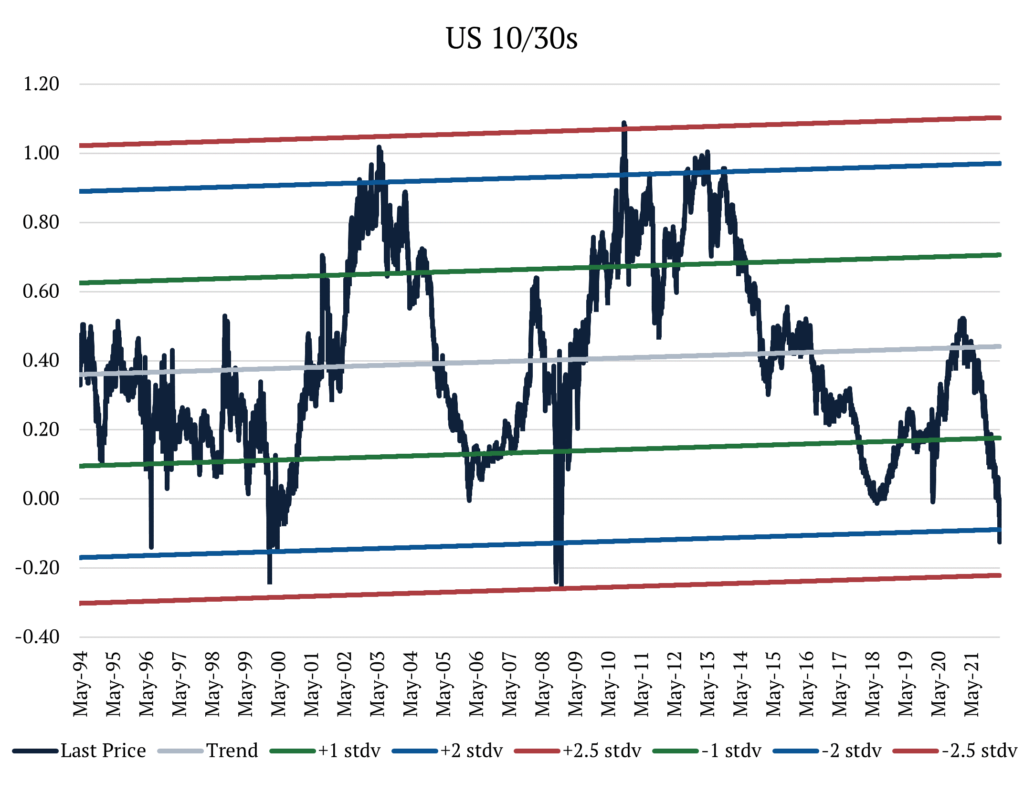
Let’s first look at the United States. In the past 30 years, the difference between 10-year and 30-year rates (10y30y for short) has been on average +40bps, staying most of the time within 1 standard deviation above or below the mean. As of today, the spread now sits 2 standard deviations below the mean. And how often does this rate differential stay at or below 2 standard deviations? Less than 0.2% of the time. In 30 years of data, the most consecutive days that it has ever stayed below that level is 5. Furthermore, in this period it has never touched 2.5 standard deviations below the mean (but it came incredibly close in 2008).
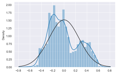
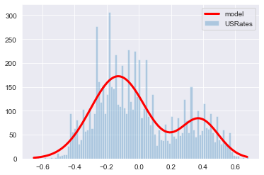
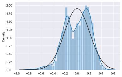
When plotting the divergence of the rates differential to its trend we can see how this data is distributed. From the charts below we see that the data fits the bimodal distribution better than the normal distribution. However, both distributions overestimate the tails when compared to the data, meaning we can assume that they will yield conservative estimates for the probabilities of very small or very large numbers. Using the probability density functions to estimate the probability of the 10y30 moving below current levels, we get a probability of 1.4% when using the normal distribution and 0.20% when using the bimodal.
When looking at Europe, we recognize that the 10y30y’s moves are more extreme than in the United States. For the past 30 years, the 10y30y has averaged +42bps. Like in the US, the spread most often lives between 1 standard deviation above or below the mean, but it spends more time below 2 standard deviations than in the US, at about 3% of the period. Today, we find ourselves sitting nearly 3 standard deviations below the mean. How often does this rate differential stay at or below 3 standard deviations? About 0.4% of the time. In 30 years of data, the greatest number of consecutive days it has ever stayed below that level was 12. Additionally in this period, it has only touched 4 standard deviations below the mean once in 2008, before retracing toward the mean on the following day.
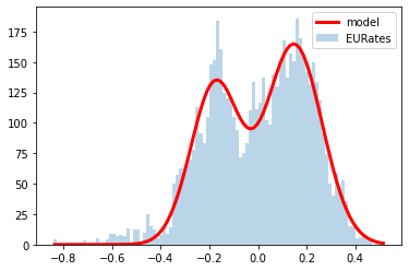
In Europe, we also find that the historical data better fits the bimodal distribution than the normal distribution. Here, the normal distribution underestimates the left-tail, while the bimodal distribution underestimates both tails, so we should take the results with a grain of salt. However, using probability density functions to estimate the probability of the 10y30ys moving below current levels, we get a probability of 0.23% by using the normal distribution and 0.24% from the bimodal.
We fundamentally believe that we are in a new normal of permanently higher inflation rates around the world (albeit less than today once supply chain disruptions ease) and with that, the return of higher term premiums. Combining that with the statistical analysis above makes us believe these markets are largely dislocated.
The emergence of the Omicron variant undoubtedly increased the risk of a repeat in lockdowns and restrictions the world saw in 2020. Markets started pricing a higher probability of a significant negative impact which we experienced last Friday, November 26th.
We are tracking the developments of the Omicron variant very closely and have begun reducing risk accordingly. Having said that, we believe that there are a few indications that this new variant also increased the upside scenario for the markets, and even more importantly, for global health.
By now, most people are familiar with the downside case the new variant represents. With more than 30 mutations of the spike protein alone (Delta variant had 9), the Omicron variant could be a severe risk to global health. 8 of the Omicron mutations have never been seen before and 9 have been seen in other variants of concern. Lab data suggests that some of the new mutations are a threat and other mutations are still being examined. Some mutations have properties that lower the efficacy of current vaccines, while others show potential for increased transmissibility.
There are also other indicators that we are currently tracking. The majority of the hospitalized cases are still in unvaccinated people (South African Health Ministry identified that most of the cases seem to be in < 50-year-olds, where the rate of vaccinations are low <20-25%, and also likely that some of these would be immuno-compromised with HIV, etc.). However, it is unclear how many had natural immunity from previous infections.
It is too early to say, but the lack of a surge in hospitalization rates in South Africa combined with early anecdotes of mild symptoms and the knowledge that this variant has had numerous mutations gives rise to the possibility of it becoming a less deadly virus. If this is the case, it could translate into much lower hospitalization and fatality rates. Combine that with higher transmissibility and increased infectivity, and we might just be staring at the light at the end of the tunnel. If this variant is less severe but much more contagious, we could quickly move toward a flu-like endemic illness.
Nevertheless, one of the most interesting pieces of information that came out last week has been given little to no attention. The Omicron variant, unlike other variants, can be tracked via a simple PCR test and will not require genomic sequencing to identify. The reason this is so important requires a practical understanding of how statistics are generated during a pandemic.
The primary source of risk arising from any pandemic is hospitalization and fatality rates, but it is tough to have an accurate number as the infection spreads (and even after it is over). Let’s use fatality rates as an example. The most common approach is to have confirmed deaths associated with the virus (a reasonably reliable indicator in most cases) divided by the number of cases (varies depending on how this is captured). The denominator could be counting only laboratory-confirmed infections, all people who displayed symptoms but were not tested, or the total number including asymptomatic cases. As expected, laboratory-confirmed cases (lowest denominator) yield the highest fatality rates.
The fact that a simple PCR test can detect the Omicron variant does not completely fix the denominator’s problem. However, within laboratory-tested cases, it will make comparison with other variables much faster and efficient. If we find that this new variant has a much lower fatality rate, policies will have to adjust for the new reality, and the risk of a repeat in lockdowns and an even bigger health crisis dissipates. We will learn more in the next couple of weeks.